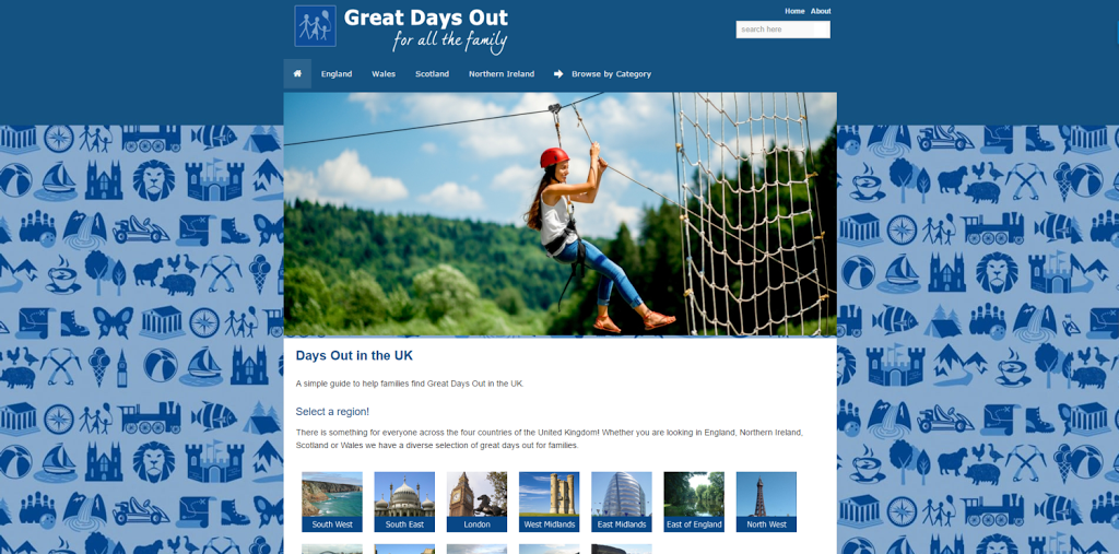
The Great Days Out website has just gone through a few look changes. A brand new background image is now visible on the website, and the homepage has a great looking header image.
The new background image is the next stage of a rebranding exercise and a definite step up from the old background image. The new background image really brings out the page content. By taking the banner image from our twitter account and tiling it we were able to create a great looking website background.
Once the background image had been added we felt that the homepage needed something extra. We then had the idea of adding a great quality header image to it. After a few minutes spent deciding on an image to use. It was placed onto the homepage using php.
We are very pleased with the new changes!


